As development gets faster thanks to new approaches and AI, there’s more time to be not only a developer but a bit of a designer—to ship interfaces that feel pleasant, not just functional. But whenever I think about design, I freeze up.
So I asked the best designer I know—@TheFairyOfTheInnerGoose: is there a “quick way” to grasp design? A handful of rules to make things decent without endless courses or a new career?
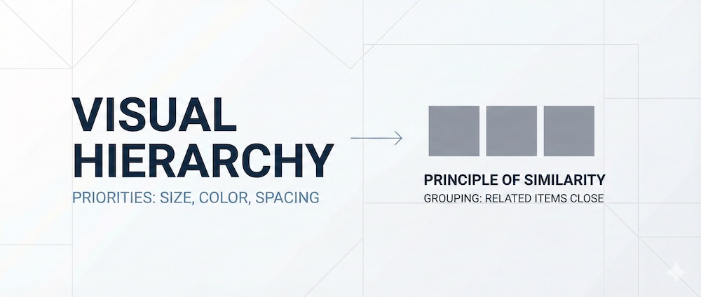
He boiled it down to two principles: visual hierarchy and the principle of similarity.
Visual hierarchy
This is about priorities. There’s always something a person should see first, then second, then third. There can’t be multiple “first priorities”: if everything is important, nothing is important. Hierarchy comes from size, color, contrast, spacing, and placement. Ideally, the user gets one clear entry point and a logical path for the eye to follow.
Principle of similarity
This is about grouping. Elements that are related by meaning should sit closer to each other than to the rest. In text, letters are closer together than words, and lines are farther apart than words, so the eye doesn’t get lost. Interfaces work the same way: a card sits farther from screen edges than its inner content; a heading is closer to its description than to the photo; cards within one block are closer to each other than to the edges. That’s how you build sensible groups of elements.
A formula that sticks
Hierarchy is meaning expressed through size, color, and the rhythm of spacing. Related things—bring them closer. Unrelated things—separate them. Important things—highlight them. That’s enough to build tidy, effective interfaces even while staying primarily a developer.
Bonus: a playlist of short videos on visual hierarchy and similarity — https://youtube.com/playlist?list=PLB-qPpAk87uJOZ8WZ_39b0uRQybZgDRPc, plus a set of “academic” UX principles — https://lawsofux.com/.
P.S. need more serious design help? Ping @TheFairyOfTheInnerGoose, he’s got you 🙂↕️
